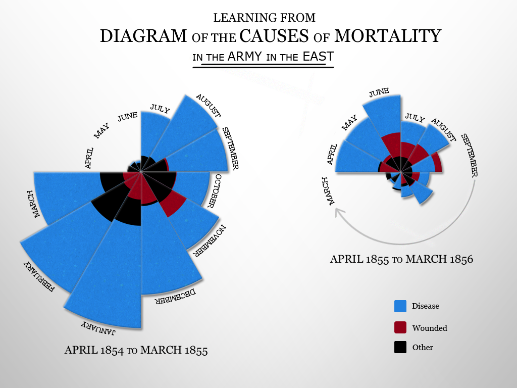
Recreating Nightingale’s Rose Diagram for the MRS 2010 Research conference. Sketched out using Processing, made shiny in Photoshop.
Florence Nightingale used the same coxcomb chart to show that far more soldiers in the Crimean War died from preventable disease than from battle wounds—a 19th-century data visualization built to change military policy, not just illustrate a report. I wanted to see if the same shape still held up as a piece of design more than 150 years later, done with modern tools instead of ink and a slide rule.